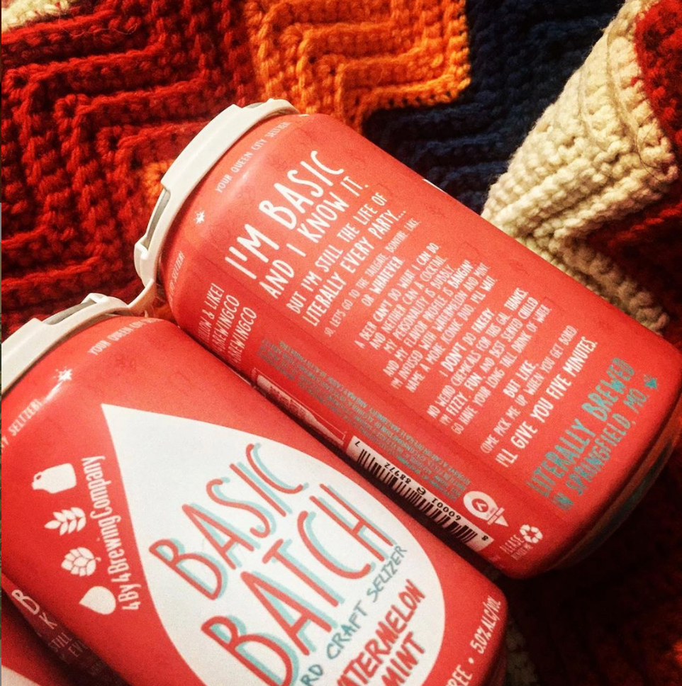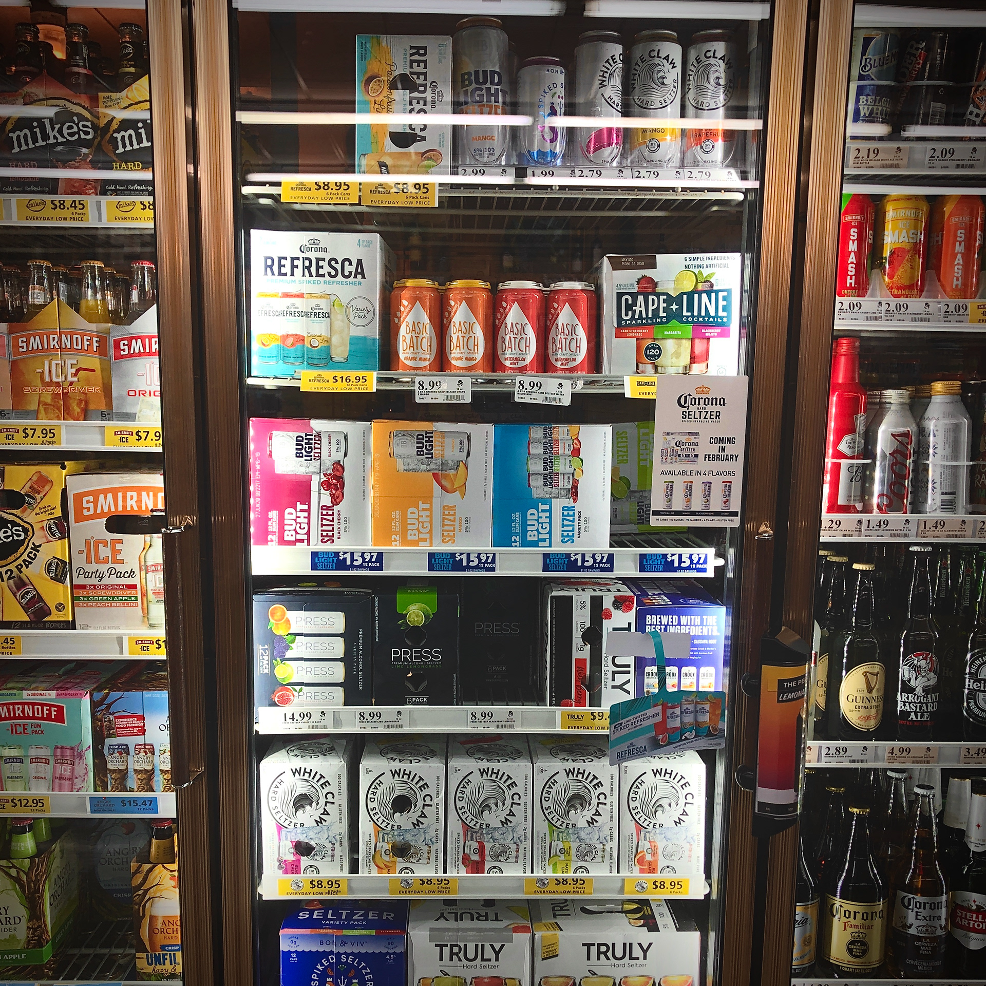
Four by Four wanted to create a totally fun and bubbly look and feel for their new line of Hard craft seltzer cans. the name Basic batch, a play on "basic bitch", was derived from the product's simplicity to brew and its limited number of ingredients.
I tried to lean in on the play-on-words to inform the design, but ultimately that wasn't what the client was looking for, regardless of how fun the end result might have been. The final design was based on one of the four icons used in their logo, the water drop. which was a nod to the fact that the hard seltzer is devoid of the other elements that make up both their logo and beer: Wheat and hops.
The end result was a simple and playful design with a bit of sassy copy to give it a bit of personality and flavor.
copywriter: Kiah Mott
The entire Design concept process in 30 seconds!
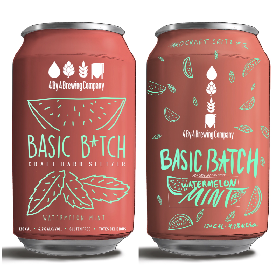
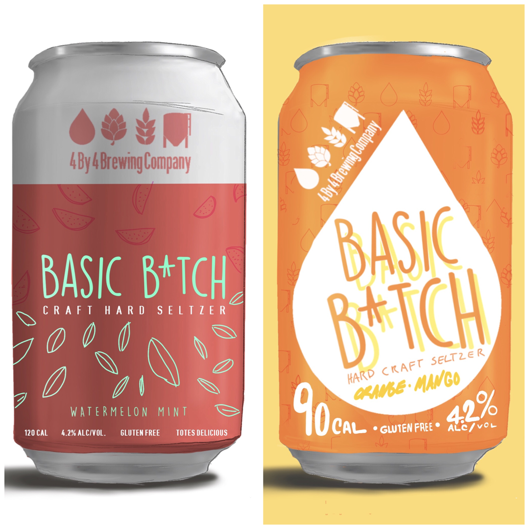
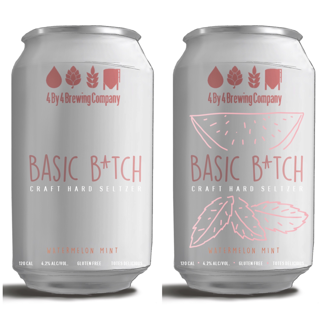
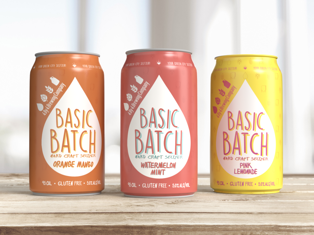
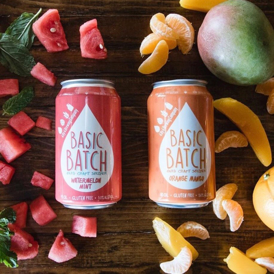
Photo credit: @matwunder / IG